Pin It
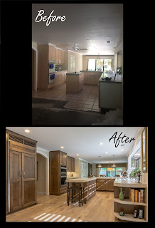
Back in September, I was asked by Lowe's corporate office to participate in designing a bath project. The competition would be between myself and one other designer in the company. If selected, my design would be featured in Lowe's Creative Ideas Magazine!
I was given a very short client interview opportunity. Our call was limited, but he did have a few specific requests. One suggestion was to have a classic style with black and white as the staple of the space, and the well known style of "Restoration Hardware" was also mentioned. At the end of the call, he said one more important thing; "It must be unique". This would be the first time since college, someone actually gave me complete freedom to be creative to my fullest extent, with very few limitations. I was ecstatic!
After all of the different phases of this project, I had spent at least forty hours getting this ready for the presentation. We were on a very tight schedule in order to provide enough time for a design review, final revisions, product ordering, construction time, and finally- the photo shoot! To my surprise, not only would the presentation be given to several of Lowe's corporate members of "In Home Selling", it would also be the marketing department of Meredith magazines. Meredith magazines (More widely known as Better Homes and Garden, and Living Magazine). I was smitten, to say the least!
When I gave the presentation, there were a few modifications discussed, but not many. I did put my personal love of nature into the design of this space, which went over quite well with the judges! I did this to help soften the extremes of the black and white contrast, and to give a nice balance of warms and cools.
At the end of the day, my design was selected to be featured in the Creative Ideas Magazine. I could not be happier with my career with Lowe's, and the many opportunities they have presented to me! I am so proud that I work for such an amazing company.
Feel free to click the link below to the view the online version of the article. Thank you for all your support!
http://www.lowes.com/creative-ideas/bed-and-bath/designer-bathroom-makeover/article
Sunday, March 13, 2016
Sunday, January 24, 2016
~Relaxing Retreat~
Pin It


Discovering what inspired my client's Master Bath remodel was quite easy. They wanted a relaxing retreat. A nostalgic place full of wonderful memories, where they could unwind after a long day's work. However, even though we determined their vision rather quickly, there were still several things that they could not envision. They needed the help of a designer!
The first thing that was puzzling to them, was how were they going to create the tile layout. They knew they wanted a "wainscoting" tile height to carry into the toilet area and parallel to the vanity. They had already selected their tile, cabinet color, and their idea of paint. But how would it look? At that point, I decided to do a 3D perspective rendering of the space. This rendering was exactly what they needed. I wanted them to know exactly what to expect. I wanted them to love it!
There was going to be A LOT of tile, and all the same collection, and color. This gave me a perfect opportunity to use patterns to give the space visual interest. We ended up using 18" tiles on the floor in a straight lay. This would make the space feel larger. From the floor to 42" up the wall we used a 12" tile diagonally, with a 6" 2x2 mosaic accent strip. With nine foot ceilings, we decided to make the space feel more open and allow the light to shine in and out of the shower. We achieved this by creating a 5" tile column starting at 80" high up to the ceiling. Oh yes, and I can't forget the niches! They are perfectly placed for my client's needs, and add a beautiful accent to the space. The tile design was one of a kind. I am so grateful I was able to be apart of it.
The next matter of business was the make-up vanity area. The lighting placement was key in creating this space. We needed to illuminate her face, and the all so common vanity down light placed above the mirror was not going to cut it. Side lights were ideal in this situation to eliminate shadows and provide an appropriate amount of light to the task area.
Now that this project is complete, I will wait patiently for another client just like them. They were amazing to work with, and appreciated my creativity. Despite the many install challenges they endured during this project, they ended up with a beautiful space that they will enjoy for years to come.
Contemporary Bliss
Pin It


This Client came to me with the goal of just replacing her backsplash, updating her appliances, removing her fluorescent light box in the ceiling, and adding a light fixture over her dining table. At this point, she had painted her golden oak cabinets to an espresso color, and she was happy with the positive change that this had given her space.
After our In Store Consultation, and discussing a few issues with her drawers falling apart on her builder grade cabinets, she called me later that week and decided to go ahead with new cabinets as well. This was ideal, as long as we could stay within her newly revised budget. She did not want to have to deal with a repair man, and knew deep down that a broken drawer or door hinge, would most likely happen in the future. She wanted a higher quality cabinet, and all of our Lowe's cabinetry companies happen to have a lifetime warranty as well. This was a huge benefit to her, since a broken drawer ten years from now will be able to be replaced at no charge, with no questions asked.
So off we went with further planning! My General Contractor and I went out to her home and took measurements of the existing space, as well as a few "before" photographs. Not only did we have to measure the walls and ceiling, but also the existing cabinets to the nearest quarter of an inch. This client had decided to keep her existing flooring, so we needed to be precise with our measurements.
The design goal for this space was to capture a tropical, yet contemporary look. We achieved this by selecting an a wide frame shaker style door, slab drawer fronts, and a rich espresso stain. The Allen & Roth Quartz countertop was a three centimeter thick slab, with a consistent pattern which gave the illusion of white sand, and small quartz crystals.
The backsplash was a neutral, yet elegant stone and porcelain mosaic. It featured cross vein-cut travertine, a white porcelain tile with a crackle glaze, and soft blue-green tile accents. This was a sophisticated, yet subtle backdrop to the tourquoise and tropical green decor that this Client has placed so flawlessly throughout her home.
A few characteristics that the former kitchen was lacking were much needed to carry out this finished project. From the chrome faucet with understated curves, to the delicate knobs on the cabinet doors, to the illuminated open glass shelves which featured a soft glow on her glassware and decor.
Las but not least, the dazzling crystal lighting was a staple of the space. This will be a conversation piece for everyone who enters this home for years to come.


Sunday, November 29, 2015
Gold River Project
Pin It
Nestled into a lovely Gold River neighborhood, this home was always cared for so nicely. Though it was a bit outdated, it was still in great condition! Even considering this fact, this couple still had a modern, rustic vision for the home that they were planning on staying in for many years to come.


When these clients first came to me, they were very particular about certain characteristics they wanted to see in their space. They had spent a lot of time thinking about what to do with these plans, and I was honored when they selected me to help transform their vision into a reality!
A few of the "must-haves" of this space, were brought to my attention right from the start. First and foremost, they needed to have custom refrigerator panels to match their cabinetry, as well as a visually pleasing grid above their Sub-Zero refrigerator to allow for ventilation. To solve this situation we used a cabinet front, voided the doors, and installed single bead molding horizontally to allow the air to flow through, without sacrificing the upscale style in this space.
The next thing we had to consider was the depth of the pop-up downdraft ventilation unit behind the cooktop, the blower unit below, and the storage issue that their existing blower system was creating. The solution to this was to increase the depth of the base cabinet to 27" deep, and run the duct work needed for the blower underneath the toe kick, and re-vent it to the exterior wall of the home. This allowed for more efficient cabinet storage. It also gave them a larger cooking surface, since there was no longer a need for the downdraft system to be part of the cooktop unit.
Now, for the custom features of this space! This kitchen would not have the same visual appeal without them. There are several things definitely worth mentioning! I will start with the decorative end panels on all exposed ends of this kitchen, upgraded toe kick molding, and decorative legs on the island. These are all great ways to upgrade a kitchen, and give it a "furniture" look.
These custom Schuler cabinets feature the "Eagle Rock, Sable Glaze" wood stain on Maple. It is a cool brown finish with a hand-rubbed antique glaze. It features beautiful variation, and creates that rustic-modern look that this client desired.
Next is the leathered "Taj Mahal" Quartzite stone countertop with a 4cm built up edge profile. Notice how the open base cabinet with the radius shelves features the countertop material as well. The veining, variation, and silky appearance of this specific stone is just breathtaking. On that note, these pictures do not do the countertops justice. They are absolutely AMAZING!
Now, I do need to elaborate a bit on the term "Quartzite". If you think you've heard of this type of material before, you may be thinking of something else. It is easy to mistake this material for "Quartz", but it is completely different. Quartzite is a naturally occurring metaphoric rock. It is created when sandstone is subjected to extreme heat and pressure caused by tectonic plate movement. These slabs are mined from the earth's crust and cut into slabs, just like Granite. The similar sounding countertop "Quartz" is 93% natural, crushed, and then mixed with resins and binders to seal the slabs throughout. Quartz is a much more commonly used product, and though it has great performance in a kitchen environment, you can not create the same natural variation with Quartz, since it is a man-made product.
I could go on and on about the features of this kitchen! It is definitely one of my favorites. The brushed nickel "Restoration Hardware" style hanging pendants, stainless steel apron sink, side coffee bar, cabinet pulls.... they are all amazing.
Thank you again for choosing me as your Kitchen Designer!


Sunday, November 15, 2015
Painted Kitchen!
Pin It
Many of my clients come to me wanting to paint or reface their cabinets, instead of replacing their cabinets in order to save money. How much will they really save?


I usually ask a few questions at that point, and their are reasons for each inquiry.
How long will you be living in your home? If you are just going to paint your cabinets to save money now, you may end up needing to replace them in 5-10 years, so just be cautious! Be sure that the painter you hire is using a high quality cabinet paint, that is less likely to breakdown through the years. You will save anywhere from three thousand to seven thousand on your cabinets if you paint instead of replace.
In regard to refacing, are you doing it just to try to save money? In the past 10 years of working in Kitchen and Bath design, I have never had a refacing quote come in less than new cabinets....including installation! There is NO COST SAVINGS! Crazy, I know. The only downside to new cabinets, is that you will be without a kitchen a week or two longer than you would with refacing.
The client's featured kitchen is a painted kitchen, with high quality paint of course! Yes, this client did save three to five thousand dollars or so on her project by doing so. This cost savings allowed her to select a high quality Silestone Quartz countertop, and a custom glass tile backsplash. We also incorporated a retrofit apron style sink from Kohler. For this client, the apron sink was a must have!
A few other economical upgrades to this space included brushed nickel knobs and pulls, a Delta pull down goose neck faucet, and new stainless steel appliances. We also created a custom table with furniture legs, and a matching Silestone Quartz countertop.


Subscribe to:
Comments (Atom)